Heatmaps & Colormaps
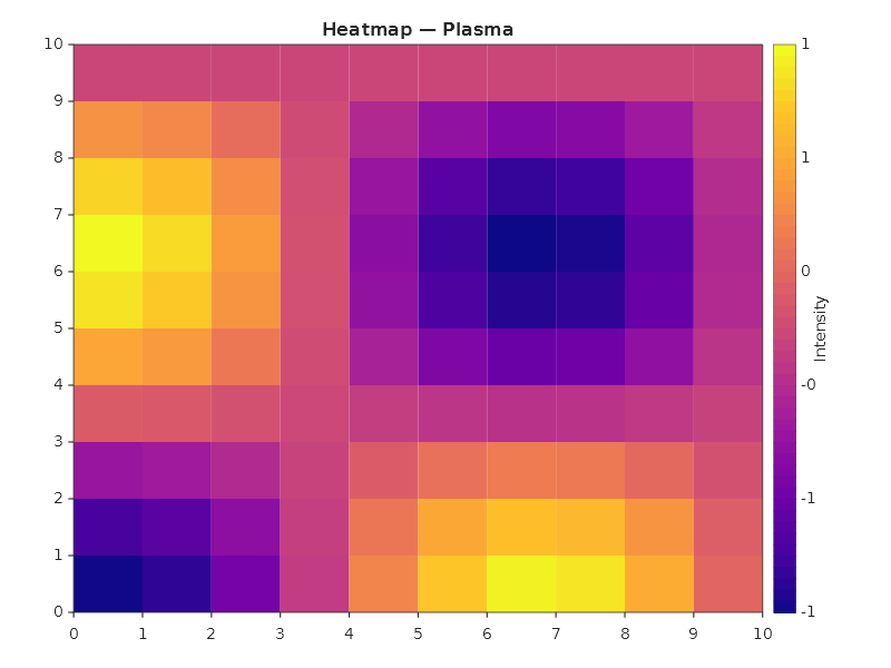
Heatmap with colorbar
double[,] matrix = new double[10, 10];
for (int r = 0; r < 10; r++)
    for (int c = 0; c < 10; c++)
        matrix[r, c] = Math.Sin(r * 0.5) * Math.Cos(c * 0.5);

Plt.Create()
    .AddSubPlot(1, 1, 1, ax => ax
        .WithTitle("Heatmap — Plasma")
        .Heatmap(matrix)
        .WithColorMap("plasma")
        .WithColorBar(cb => cb with { Label = "Intensity" }))
    .TightLayout()
    .Save("heatmap.svg");
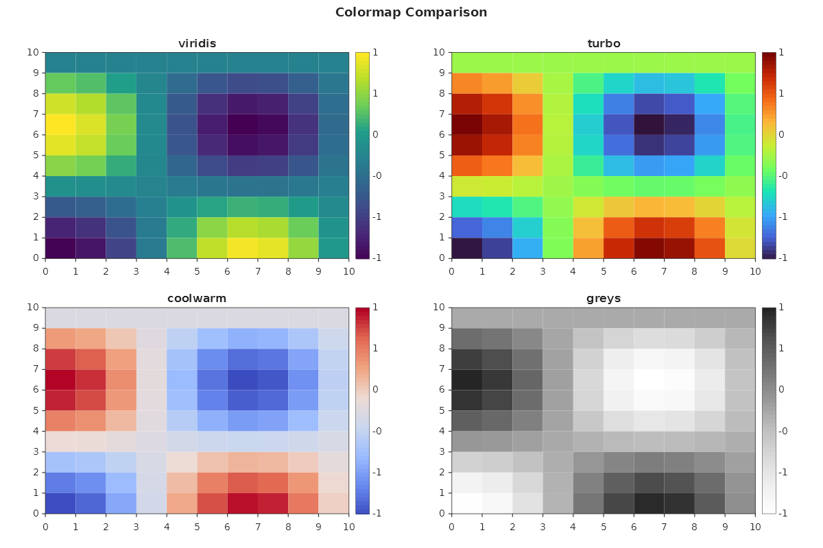
Colormap comparison
MatPlotLibNet ships 142 colormaps (71 base maps, each with an auto-registered reversed _r variant). Here are four popular ones side by side:
string[] maps = ["viridis", "turbo", "coolwarm", "greys"];
var builder = Plt.Create()
    .WithTitle("Colormap Comparison")
    .WithSize(1200, 800);

for (int i = 0; i < maps.Length; i++)
{
    var mapName = maps[i];
    builder.AddSubPlot(2, 2, i + 1, ax => ax
        .WithTitle(mapName)
        .Heatmap(matrix)
        .WithColorMap(mapName)
        .WithColorBar());
}

builder.TightLayout().Save("colormap_comparison.svg");
Colorbar customization
Plt.Create()
    .AddSubPlot(1, 1, 1, ax => ax
        .Heatmap(matrix)
        .WithColorMap("viridis")
        .WithColorBar(cb => cb with
        {
            Label = "Temperature (°C)",
            Orientation = ColorBarOrientation.Horizontal,
        }))
    .TightLayout()
    .Save("colorbar_custom.svg");
Color normalization
Control how data values map to colors:
// Log normalization — useful when data spans orders of magnitude
Plt.Create()
    .AddSubPlot(1, 1, 1, ax => ax
        .Heatmap(logData)
        .WithColorMap("plasma")
        .WithNormalizer(Normalizer.Log())
        .WithColorBar(cb => cb with { Label = "Log scale" }))
    .Save("heatmap_log.svg");

// Two-slope normalization — center on zero
Plt.Create()
    .AddSubPlot(1, 1, 1, ax => ax
        .Heatmap(divergingData)
        .WithColorMap("coolwarm")
        .WithNormalizer(Normalizer.TwoSlope(vCenter: 0))
        .WithColorBar(cb => cb with { Label = "Anomaly" }))
    .Save("heatmap_twoslope.svg");
Heatmap with custom series config
Plt.Create()
    .AddSubPlot(1, 1, 1, ax => ax
        .Heatmap(matrix, s =>
        {
            s.ColorMap = ColorMaps.Turbo;
        })
        .WithColorBar())
    .Save("heatmap_series.svg");
Annotated heatmap (correlation matrix)
ShowValues = true renders each cell's numeric value on top of the colour fill. The text
colour auto-contrasts black/white per cell using Rec. 709 luminance, so labels stay
readable across the colour map. Use CellValueFormat with any standard .NET numeric
format string — "F2" (default) for two decimals, "P1" for percent.
double[,] corr = ComputeCorrelationMatrix(returns);

Plt.Create()
    .AddSubPlot(1, 1, 1, ax => ax
        .WithTitle("Asset Correlation Matrix")
        .Heatmap(corr, s =>
        {
            s.ColorMap = ColorMaps.RdBu_r;
            s.ShowValues = true;
            s.CellValueFormat = "F2";
        })
        .WithColorBar())
    .Save("heatmap_annotated.svg");
Override the auto-contrast text colour with CellValueColor when you want the labels to
match a brand colour or stay constant across the matrix.
Triangular-mask heatmap
Symmetric matrices (correlation, covariance, distance) are redundant above and below the
diagonal — MaskMode hides the redundant half so the eye focuses on each pair once.
The strict variants also hide the diagonal (constant 1 for correlation matrices).
Plt.Create()
    .AddSubPlot(1, 1, 1, ax => ax
        .WithTitle("Lower-triangle correlation")
        .Heatmap(corr, s =>
        {
            s.ColorMap = ColorMaps.RdBu_r;
            s.ShowValues = true;
            s.MaskMode = HeatmapMaskMode.UpperTriangleStrict;  // hide upper half + diagonal
        })
        .WithColorBar())
    .Save("heatmap_lower_triangle.svg");
HeatmapMaskMode values:
| Value | Hides cells where | Diagonal kept? |
|---|---|---|
None |
(nothing) | yes |
UpperTriangle |
col > row |
yes |
LowerTriangle |
col < row |
yes |
UpperTriangleStrict |
col >= row |
no |
LowerTriangleStrict |
col <= row |
no |
Image (imshow)
Display 2D arrays as images:
Plt.Create()
    .AddSubPlot(1, 1, 1, ax => ax
        .Image(matrix)
        .WithColorMap("gray")
        .WithColorBar())
    .Save("imshow.svg");
2D histogram (density)
var rng = new Random(42);
double[] x = Enumerable.Range(0, 5000).Select(_ => rng.NextGaussian(0, 1)).ToArray();
double[] y = Enumerable.Range(0, 5000).Select(_ => rng.NextGaussian(0, 1)).ToArray();

Plt.Create()
    .AddSubPlot(1, 1, 1, ax => ax
        .Histogram2D(x, y, bins: 30)
        .WithColorMap("viridis")
        .WithColorBar(cb => cb with { Label = "Count" }))
    .Save("hist2d.svg");
Pseudocolor mesh
Plt.Create()
    .AddSubPlot(1, 1, 1, ax => ax
        .Pcolormesh(xEdges, yEdges, data)
        .WithColorMap("inferno")
        .WithColorBar())
    .Save("pcolormesh.svg");
Popular colormaps
| Category | Colormaps |
|---|---|
| Perceptual | viridis, plasma, inferno, magma, cividis |
| Sequential | greys, purples, blues, greens, oranges, reds |
| Diverging | coolwarm, RdBu, PiYG, PRGn, BrBG, seismic |
| Cyclic | twilight, hsv |
| Qualitative | tab10, tab20, Set1, Set2, Set3, Pastel1, Paired |
| Other | turbo, jet, hot, cool, spring, summer, autumn, winter |
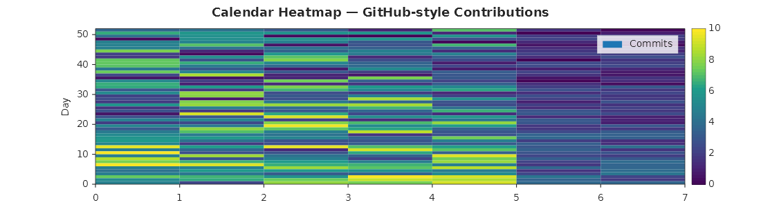
Calendar heatmap (GitHub-style)
A 52 × 7 heatmap where rows are weeks and columns are days of the week.
var rng = new Random(7);
var data = new double[52, 7];
for (int w = 0; w < 52; w++)
    for (int d = 0; d < 7; d++)
    {
        double base_ = (d < 5) ? rng.NextDouble() * 8 : rng.NextDouble() * 2;
        data[w, d] = Math.Max(0, base_ + w * 0.05 + rng.NextDouble() * 2 - 1);
    }

Plt.Create()
    .WithTitle("Calendar Heatmap — Contributions")
    .WithSize(1100, 300)
    .AddSubPlot(1, 1, 1, ax => ax
        .Heatmap(data, s => { s.ColorMap = ColorMaps.Viridis; })
        .WithColorBar()
        .SetXLabel("Week")
        .SetYLabel("Day"))
    .Save("calendar_heatmap.svg");