Dashboard tiles & timelines
Install:
dotnet add package MatPlotLibNet
Single-panel KPI tiles and horizontal state timelines for operational dashboards, fleet status views, and monitoring UIs. A tile draws a formatted value and a timeline a row of coloured segments along a time axis. Compose them with mosaic or subplot layouts.
A tile is a number, not a chart, but the axes it stands on still draw their frame and
ticks (0 to 1) unless told otherwise. Call HideAllAxes() on a tile's axes, as the
samples below do; Plt.OpsDashboard() does the same for its tiles.
Stat tile — single KPI number
A StatTileSeries renders one big formatted headline number with an optional label
beneath it. The tile fills whatever plot region it occupies; use one subplot per tile.
// "12 participants" tile — plain integer, no accent color
Plt.Create()
    .AddSubPlot(1, 1, 1, ax => ax
        .StatTile(12, t => t.Label = "Participants")
        .HideAllAxes())
    .Save("tile_participants.svg");
The Format property follows standard .NET numeric format strings (invariant culture;
default "0.##" strips trailing zeros). Set AccentColor to draw the headline in a
warning or brand colour:
// Alert count in red when non-zero
int alertCount = 3;
Plt.Create()
    .AddSubPlot(1, 1, 1, ax => ax
        .StatTile(alertCount, t =>
        {
            t.Label       = "Alerts";
            t.AccentColor = alertCount > 0 ? Colors.Red : null;
            t.Format      = "0";   // integer, no decimals
        })
        .HideAllAxes())
    .Save("tile_alerts.svg");
Multi-tile mosaic dashboard
Use Plt.Mosaic(...) to compose several KPI tiles in a grid. Each letter in the
pattern string becomes a panel:
Plt.Mosaic("ABC\nDEF")
    .Panel("A", ax => ax.StatTile(12,       t => { t.Label = "Participants"; t.Format = "0"; }).HideAllAxes())
    .Panel("B", ax => ax.StatTile(0,        t => { t.Label = "Alerts";       t.Format = "0"; }).HideAllAxes())
    .Panel("C", ax => ax.StatTile(99.4,     t => { t.Label = "Uptime %";     t.Format = "0.0"; }).HideAllAxes())
    .Panel("D", ax => ax.StatTile(1_042,    t => { t.Label = "Messages/s";   t.Format = "0"; }).HideAllAxes())
    .Panel("E", ax => ax.StatTile(3.7,      t => { t.Label = "Latency ms";   t.Format = "0.0"; }).HideAllAxes())
    .Panel("F", ax => ax.StatTile(2,        t =>
    {
        t.Label       = "Errors";
        t.AccentColor = Colors.Red;
        t.Format      = "0";
    }).HideAllAxes())
    .Configure(fig => fig
        .WithTitle("Fleet Overview")
        .WithTheme(Theme.Dark)
        .WithSize(900, 300))
    .Save("fleet_tiles.svg");
Combining a tile with a chart
Place a KPI tile beside a regular chart using AddSubPlot with a GridSpec:
double[] x = Enumerable.Range(0, 60).Select(i => (double)i).ToArray();
double[] y = x.Select(v => 50 + 20 * Math.Sin(v * 0.3)).ToArray();

Plt.Create()
    .WithGridSpec(1, 2, widthRatios: [3.0, 1.0])
    .AddSubPlot(GridPosition.Single(0, 0), ax => ax
        .Plot(x, y, s => s.Label = "Signal")
        .WithTitle("Live signal")
        .WithLegend())
    .AddSubPlot(GridPosition.Single(0, 1), ax => ax
        .StatTile(y[^1], t =>
        {
            t.Label  = "Last value";
            t.Format = "0.0";
        })
        .HideAllAxes())
    .TightLayout()
    .Save("chart_with_tile.svg");
State timeline — discrete coloured segments
A StateTimelineSeries renders a single-row horizontal bar divided into coloured
rectangles, one per StateSegment. Each segment spans [Start, End] in data units
and shows a centred text label. The Y range is fixed at [0, 1] so the bar fills
the full plot height.
The StateSegment record struct takes four positional arguments:
// StateSegment(Start, End, Label, Color)
var segs = new[]
{
    new StateSegment(0,   30,  "Starting",  Colors.Gray),
    new StateSegment(30,  120, "Running",   Colors.Tab10Green),
    new StateSegment(120, 140, "Degraded",  Colors.Tab10Orange),
    new StateSegment(140, 180, "Running",   Colors.Tab10Green),
    new StateSegment(180, 200, "Stopped",   Colors.Red),
};

Plt.Create()
    .StateTimeline(segs, s => s.Label = "Worker A")
    .WithTitle("Worker state over time")
    .Save("state_timeline.svg");
Date X-axis timeline
Pass OA-date X values and call SetXDateAxis() for automatic date tick formatting:
DateTime t0 = new DateTime(2026, 6, 1);
var segs = new[]
{
    new StateSegment(t0.ToOADate(),                    t0.AddHours(6).ToOADate(),  "Starting", Colors.Gray),
    new StateSegment(t0.AddHours(6).ToOADate(),        t0.AddHours(20).ToOADate(), "Running",  Colors.Tab10Green),
    new StateSegment(t0.AddHours(20).ToOADate(),       t0.AddHours(22).ToOADate(), "Stopped",  Colors.Red),
    new StateSegment(t0.AddHours(22).ToOADate(),       t0.AddDays(1).ToOADate(),   "Running",  Colors.Tab10Green),
};

Plt.Create()
    .AddSubPlot(1, 1, 1, ax => ax
        .StateTimeline(segs)
        .SetXDateAxis()
        .WithTitle("Node uptime — June 1"))
    .Save("timeline_dates.svg");
Stacked multi-row timelines (mosaic)
Stack one timeline per participant by assigning each its own subplot row:
var workerA = new StateSegment[]
{
    new(0, 40,  "Running", Colors.Tab10Green),
    new(40, 55, "Stopped", Colors.Red),
    new(55, 100,"Running", Colors.Tab10Green),
};
var workerB = new StateSegment[]
{
    new(0,  20,  "Running",  Colors.Tab10Green),
    new(20, 35,  "Degraded", Colors.Tab10Orange),
    new(35, 100, "Running",  Colors.Tab10Green),
};
var workerC = new StateSegment[]
{
    new(0, 100, "Running", Colors.Tab10Green),
};

Plt.Mosaic("A\nB\nC")
    .Panel("A", ax => ax.StateTimeline(workerA, s => s.Label = "Worker A").WithTitle("Worker A"))
    .Panel("B", ax => ax.StateTimeline(workerB, s => s.Label = "Worker B").WithTitle("Worker B"))
    .Panel("C", ax => ax.StateTimeline(workerC, s => s.Label = "Worker C").WithTitle("Worker C"))
    .Configure(fig => fig
        .WithTitle("Fleet state timeline")
        .WithSize(900, 350)
        .TightLayout())
    .Save("fleet_timelines.svg");
Replay: click an event, follow the playback position
A timeline of events beside a video answers two questions: which event did the reader point at, and where is
the playback now. Hovering a segment shows the event and the stretch it covers (Replay: Event 2 (30–45)),
and a click tells your application which segment it was. The marker for the current position is a reference
line whose Value you change as playback moves, so the figure is not rebuilt and the reader's zoom survives.
StateSegment[] events =
[
    new(0, 15, "Event 1", Colors.Blue),
    new(30, 45, "Event 2", Colors.Orange),
    new(60, 90, "Event 3", Colors.Green),
];

ReferenceLine? playhead = null;
var figure = Plt.Create()
    .AddSubPlot(1, 1, 1, ax => ax
        .StateTimeline(events, s => s.Label = "Replay")
        .SetXLim(0, 90)
        .AxVLine(0, line => playhead = line))
    .Build();

// PointIndex is the segment's position in `events`; point.DataX is the instant under the cursor instead.
chartControl.DataPointClicked += point =>
{
    video.Seek(events[point.PointIndex].Start);
};

// Each playback tick moves the line in place, then asks the control to repaint (WPF: InvalidateVisual).
void OnPlaybackTick(double seconds)
{
    playhead!.Value = seconds;
    chartControl.InvalidateVisual();
}

video.PositionChanged += OnPlaybackTick;   // your player's position, in seconds
A segment is hit by containing the cursor, edges included; where segments overlap, the one drawn last answers.
A click is a press and a release on the same spot, and needs IsInteractive; moving the pointer further makes it a
drag, which pans along time. The wheel zooms along time, and lanes that share one time axis move together. The whole
window, with several lanes, a date axis and a marker that follows playback, is on the page
State timeline in WPF.
Tiles + timelines combined
Mix stat tiles and state timelines in a single dashboard:
var alarmHistory = new StateSegment[]
{
    new(0,  10,  "OK",    Colors.Tab10Green),
    new(10, 14,  "ALARM", Colors.Red),
    new(14, 30,  "OK",    Colors.Tab10Green),
};

Plt.Mosaic("AAB\nAAC")
    .Panel("A", ax => ax
        .StateTimeline(alarmHistory)
        .WithTitle("Alarm history (minutes)"))
    .Panel("B", ax => ax.StatTile(2, t => { t.Label = "Alerts today"; t.AccentColor = Colors.Red; t.Format = "0"; }).HideAllAxes())
    .Panel("C", ax => ax.StatTile(99.3, t => { t.Label = "Uptime %"; t.Format = "0.0"; }).HideAllAxes())
    .Configure(fig => fig
        .WithTheme(Theme.Dark)
        .WithSize(900, 400)
        .TightLayout())
    .Save("ops_dashboard.svg");
Full ops dashboard — tiles + timeline + thresholded chart
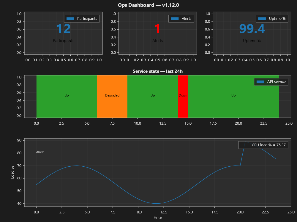
This figure combines all four dashboard conveniences: a KPI tile row
(StatTileSeries), a StateTimelineSeries for service health, and a line chart that
uses the Threshold(...) convenience. Threshold(...) draws a dashed reference line
and shades the breach, and WithLegendValues() makes the legend show the live reading:
var serviceHistory = new StateSegment[]
{
    new(0,  6,  "Up",       Colors.Tab10Green),
    new(6,  9,  "Degraded", Colors.Tab10Orange),
    new(9,  14, "Up",       Colors.Tab10Green),
    new(14, 15, "Down",     Colors.Red),
    new(15, 24, "Up",       Colors.Tab10Green),
};

double[] hours = Enumerable.Range(0, 48).Select(i => i * 0.5).ToArray();
double[] load  = hours.Select(h => 55 + 15 * Math.Sin(h * 0.4) + (h > 20 ? 20 : 0)).ToArray();

Plt.Create()
    .WithTitle("Ops Dashboard")
    .WithTheme(Theme.Dark)
    .WithSize(1000, 750)
    .WithGridSpec(3, 3, heightRatios: [1.0, 1.0, 1.6])
    .AddSubPlot(GridPosition.Single(0, 0), ax => ax
        .StatTile(12, t => { t.Label = "Participants"; t.Format = "0"; })
        .HideAllAxes())
    .AddSubPlot(GridPosition.Single(0, 1), ax => ax
        .StatTile(1, t => { t.Label = "Alerts"; t.AccentColor = Colors.Red; t.Format = "0"; })
        .HideAllAxes())
    .AddSubPlot(GridPosition.Single(0, 2), ax => ax
        .StatTile(99.4, t => { t.Label = "Uptime %"; t.Format = "0.0"; })
        .HideAllAxes())
    .AddSubPlot(new GridPosition(1, 2, 0, 3), ax => ax
        .StateTimeline(serviceHistory, s => s.Label = "API service")
        .WithTitle("Service state — last 24h"))
    .AddSubPlot(new GridPosition(2, 3, 0, 3), ax => ax
        .Plot(hours, load, s => s.Label = "CPU load %")
        .Threshold(80.0, Orientation.Horizontal, ThresholdBreach.Above,
            color: Colors.Red, label: "Alarm")
        .SetXLabel("Hour")
        .SetYLabel("Load %")
        .WithLegend()
        .WithLegendValues())
    .TightLayout()
    .Save("ops_dashboard_full.svg");
See Threshold convenience and
Legend value display for the full parameter
reference of Threshold(...) and WithLegendValues().
Operations dashboard — Plt.OpsDashboard()
The operations dashboard template builds a control-room screen. An operator may watch such a screen for eight hours and must still notice the one thing on it that changes. Designing such a screen is a problem with a long-settled literature behind it, and this template follows that literature.
Colour marks only what needs attention. When nothing needs attention, the screen shows no colour, not
even green. Colouring the healthy states would leave an abnormal state nothing to stand out against, and
operators would stop looking at the tiles. The colours come from the theme's AlarmPalette: Okabe-Ito amber
means look at this and vermillion means act now. These two colours were chosen because roughly eight
percent of men cannot tell red from green, and these two stay distinguishable for all of them. Colour is
never the only signal: every coloured mark also states the same thing in words.
A silent source is hatched, not coloured. On a monitored fleet, losing contact with a source is the most
common failure, and it is not the same failure as the source being broken. A dashboard that shows both the
same way misleads the operator. Use StatTileSeries.Hatch and StateSegment.Hatch to mark a source that has
gone silent.
The caller supplies the clock. WithWindow(end, span) takes the end instant as an argument. The library
never reads DateTime.Now. A figure that read the wall clock could not be tested, could not be replayed, and
could only render the dashboard for the current moment.
using MatPlotLibNet.Models.Series;
using MatPlotLibNet.Styling;

var now = DateTime.UtcNow;                       // the caller's clock, not the library's
var theme = Theme.OpsNight;                      // or OpsPanel / OpsWarm / OpsContrast

Plt.OpsDashboard()
    .WithTitle("Order service — gateway")
    .WithWindow(now, TimeSpan.FromMinutes(5))    // ONE window, shared by every time panel
    .WithNormalBand(2200, 2700)

    // A tile carries value + target + gap + trend. A bare big number is a failed pattern: without a
    // comparative the reader cannot tell whether it is good or bad, and must supply the missing context
    // from memory — which they mostly cannot.
    .AddTile(15, t =>
    {
        t.Label = "Buses";
        t.Caption = "all 15 normal";             // no accent → the tile wears the theme's neutral shade
    })
    .AddTile(28.1, t =>
    {
        t.Label = "RFx p99";
        t.Format = "0.0' ms'";
        t.Target = 25;
        t.Caption = "target 25 ms · +3.1 over";
        t.Trend = p99History;                    // an inline Tufte sparkline: no axis, no frame, no ticks
        t.AccentColor = theme.Alarm.Warning;     // colour ONLY because it is out of band
    })
    .AddTile(0, t =>
    {
        t.Label = "Exchange";
        t.Caption = "no contact";
        t.Hatch = HatchPattern.ForwardDiagonal;  // unknown ≠ broken — a pattern, never a colour
    })
    .AddTile(3.8, t =>
    {
        t.Label = "Nexus";
        t.Format = "0.0' µs/msg'";
        t.Target = 6;
        // A caption may answer TWO questions — "is this good or bad" and "measured over what". Newlines
        // stack, so the second answer gets its own row instead of running the first one off the tile.
        t.Caption = "threshold 6" + Environment.NewLine + "2148 msg · 1 s";
    })

    .AddTimeline(busSegments, l => l.Label = "Service Bus")
    .AddTrend(clock, publish, s => s.Label = "publish")
    .AddTrend(clock, consume, s => s.Label = "consume")
    .ConfigureTrend(ax => ax.SetYLabel("messages / s"))
    .Build()
    .WithTheme(theme)
    .Save("control-room.svg");
The rolling axis
WithWindow pins the axis bounds exactly and lets the locator round only the ticks. This is what
makes a live chart move smoothly instead of in jumps. An automatic axis expands its bounds outward to the
nearest round number, so it stands still while the data grows into it and then jumps a whole step at once.
Pinned bounds slide continuously, and the round ticks move out of frame together with the data they belong
to.
Bullet graphs instead of dials
BulletGraphSeries is Stephen Few's replacement for the radial gauge. The high-performance-HMI literature
rejects the dial: a dial uses a quarter of a panel to say what a bar says in a fifth of it, and dials cannot
be stacked. A bullet graph shows the measure, the target and the qualitative ranges in one thin strip. Its
bands are one hue at varying intensity, never red/amber/green, so colour-blind readers can read them and the
bands do not use the alarm palette for a background.
ax.Bullet(2412, b =>
{
    b.Target = 2500;
    b.Bands = [new(1800, band1), new(2200, band2), new(2800, band3)];
});
A tile that leads somewhere — progressive disclosure
A tile can link to a detail panel that opens under it on a click. The tile shows that it is a link in three
ways at once, never by colour alone: a chevron in its corner (▸ closed, ▾ open), the pointer cursor, and an
aria-label. Url follows matplotlib's Artist.set_url idiom: the whole tile becomes an SVG <a href>. This
needs no script, so it works in a static file, inline in a Blazor page, and in a saved SVG. The tile can take
keyboard focus and be activated with Enter. The open or closed state is part of the URL, so a monitoring wall
that redraws its tiles twice a second cannot lose it, and an operator can paste the URL to a colleague.
bool open = panel == "processes";
dashboard.AddTile(running, t =>
{
    t.Label = "Processes";
    t.Url = open ? "/" : "/?panel=processes";   // the anchor toggles the detail
    t.Expanded = open;                          // ▾ while the detail is shown below
});
In Blazor (InteractiveServer), the router intercepts a same-origin SVG anchor in the same way as an HTML one
(findAnchorTarget matches SVGAElement). The click is therefore a client-side navigation: the circuit
survives, and a [SupplyParameterFromQuery(Name = "panel")] string? Panel property on the page re-renders
with the detail open.
Small multiples — twenty processes, compared
With more than five or six lines on one axes, a reader can no longer tell the lines apart and ends up reading the legend instead of the chart. Small multiples put the name inside each panel and give every panel the same axes, so twenty processes appear as twenty comparable shapes. Task Manager's per-core grid and Grafana's repeated panel are familiar examples:
var grid = Plt.SmallMultiples()
    .WithMaxCols(4)                                  // wraps balanced: 5 panels read as 3+2, never 4+1
    .WithPanelSize(300, 110)
    .WithSharedYLimits(0, 100)                       // the SAME y on every panel — that is what compares
    .WithWindow(now, TimeSpan.FromMinutes(3))        // the same pinned x, time-aware ticks
    .ConfigurePanel(ax => ax.AxHLine(100, r => { r.Label = "100 % of one core"; r.Color = theme.Alarm.Warning; }));
foreach (var process in processes)
{
    grid.AddPanel($"{process.Name} · {process.Cpu:0} %", process.Times, process.Cpu);
}
Figure figure = grid.Build().WithTheme(Theme.OpsNight).Build();
The label is an axes-fraction annotation (AnnotationCoordinates.AxesFraction), so it sits top-left whatever
the limits are. For a threshold on a time axis, use AxHLine(value, r => r.Label = …), never
Threshold(…, label). The latter anchors its label at x = 0 in data coordinates, which on a date axis is the
year 1899, off the canvas.
A topology panel — which service is talking to which
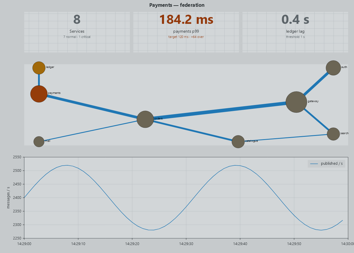
A tile row says what is wrong. A topology panel — a service map, a dependency graph, call it what your team
calls it — says where it is wrong and what else is downstream of it. AddTopology puts one on the
dashboard: one node per service, one directed edge per call, coloured by the same alarm ramp the tiles use, so
the sick node is the only coloured thing on the panel.
var services = new List<GraphNode>
{
    new("gateway",  Label: "gateway",  SizeScalar: 2.0, ColorScalar: 0.10),
    new("orders",   Label: "orders",   SizeScalar: 1.6, ColorScalar: 0.10),
    new("payments", Label: "payments", SizeScalar: 1.6, ColorScalar: 0.95),   // the one that needs attention
    new("ledger",   Label: "ledger",   SizeScalar: 1.2, ColorScalar: 0.45),
};

var calls = new List<GraphEdge>
{
    new("gateway", "orders", 4.0, IsDirected: true),      // Weight is the call rate: it sets the line thickness
    new("orders", "payments", 3.0, IsDirected: true),
    new("payments", "ledger", 2.0, IsDirected: true),
};

Plt.OpsDashboard()
    .WithTitle("Payments — federation")
    .WithWindow(now, TimeSpan.FromMinutes(5))
    .AddTile(15, t => t.Label = "Buses")
    .AddTimeline(busSegments, l => l.Label = "Service Bus")
    .AddTopology(services, calls, s =>
    {
        s.Layout = GraphLayout.ForceDirected;
        s.LayoutSeed = 42;                   // the SAME picture on every refresh
        s.LayoutIterations = 300;
        s.ColorMap = theme.Alarm.Ramp;       // resting → warning → critical, the same ramp as the tiles
        s.NodeRadiusScale = 22.0;
        s.EdgeThicknessScale = 4.0;
    })
    .AddTrend(clock, publish, s => s.Label = "publish")
    .Build()
    .WithTheme(theme)
    .Save("control-room.svg");
Three things make it a panel an operator can live with:
- Choose the seed. A force-directed layout starts from positions drawn with a seed (
LayoutSeed, 0 unless you set it) and runs a fixed number of iterations, so the same services and calls draw the same map on every refresh, run after run. Another seed gives another arrangement of the same graph: try a few, keep the one that reads best, and an operator who has learned wherepaymentssits finds it there every time. - The coordinates are hidden for you. The numbers on the axes of a topology mean nothing, so the panel
draws no ticks, no grid and no spines. That is
AddTopology's doing, not yours. - Colour only the sick node.
ColorScalarruns through the theme's alarm ramp, so a healthy fleet is a panel with no colour on it and the one node that needs attention is the only thing that draws the eye.
Where the row lands is not yours to choose, and that is deliberate. The panel goes between the timelines and the trend. The trend is the last row and carries the tallest height ratio; a panel appended after it would take that ratio and leave the trend at zero height — drawing nothing, and reporting no error.
A treemap of the fleet — area is size, colour is load
A treemap rectangle shows two variables: its area comes from TreeNode.Value and its colour comes from
TreeNode.ColorValue through the series' normalizer and colour map. Put the slow-moving quantity on the area
and the live quantity on the colour. Here the area is memory, so the layout stays put. The squarified layout
sorts by value, so if the area were CPU the layout would reshuffle on every update:
var fleet = new TreeNode
{
    Label = "Svc",
    Children = processes.Select(p => new TreeNode
    {
        Label = $"{p.Name} · {p.Cpu:0} %",
        Value = p.WorkingSetMb,            // area
        ColorValue = p.Cpu,                // colour: % of ONE core
        Hatch = p.Silent ? HatchPattern.ForwardDiagonal : HatchPattern.None,   // "no information", never a colour
    }).ToList(),
};
ax.Treemap(fleet, s =>
{
    s.ColorMap = theme.Alarm.Ramp;         // resting → warning (50 %) → critical (100 %)
    s.VMin = 0; s.VMax = 100;
    s.LabelFit = TreemapLabelFit.Fit;      // a label wider than its rect is not painted across the neighbours
});
Measured at 1400×300: nine processes label cleanly. At twenty processes, LabelFit.Always painted nine labels
across their neighbours. A wall with more than about 12 processes needs more height, or Fit/Truncate. An
empty tree draws nothing.
A tree grid — the numbers a treemap cannot show
When the leaves are many and small, area no longer shows anything useful. In one running system, two lanes out of
twenty-three carried every message in an hour. Shown as a treemap, that is two rectangles and twenty-one
slivers. A tree grid shows the numbers in rows instead. Rows can be compared exactly, and ARIA has a role for
this shape, treegrid:
TreeGridRow[] rows =
[
    new("Svc", ["24 %", "25 323", "10 404 KiB"]) { Expanded = true },
    new("Svc.Billing", ["10 %", "14 920", "6 972 KiB"])
        { Depth = 1, Url = "/?process=Svc.Billing", Expanded = false },   // a link, so expanding needs no script
    new("BillingCycle", ["", "14 920", "6 972 KiB"]) { Depth = 2 },
];

Plt.Create().WithSize(1400, 300).WithTheme(Theme.OpsNight)
    .AddSubPlot(1, 1, 1, ax =>
    {
        ax.TreeGrid(rows, s => { s.ColumnHeaders = ["CPU", "Messages", "Traffic"]; s.ColumnWidth = 140; });
        ax.HideAllAxes();
    })
    .Build();
Values are right-aligned per column so digits line up; a row with a Url becomes an <a href> carrying
aria-expanded, and every row carries aria-level. Rows past the region's edge are dropped rather than drawn
over the panel below.
A cell that carries its number
TreeNode.Headline puts the measure under the name in larger text, so a treemap cell has the same layout as a
stat tile:
new TreeNode { Label = "Svc.Ingest", Headline = "13 %", Value = 1, ColorValue = 13 }
The headline is dropped before the name, because a number on its own does not tell the reader what it measures.
A log axis for latencies
SetYScale(AxisScale.Log) ranges over the positive values only: a measurement bucket whose value is 0 µs is
masked, not drawn. The axis pads in log space and installs decade ticks (10¹, 10²) by itself. For data
that legitimately includes zero, use SetYScaleSymLog(linthresh) instead; it keeps a linear band around zero.
The wall, read rather than seen
An operator may have to read a monitoring wall over the phone, from a text terminal, or with a screen reader.
The SVG carries role="img", which means the chart itself says nothing but its title. So the dashboard also
provides its data as tables:
foreach (var table in dashboard.ToDataTables())
{
    Console.WriteLine(table.ToMarkdown());   // or ToHtml() into the page, or ToCsv() behind a download
}
Each tile puts all its parts into the table: label · value · target · caption · trend, with an empty cell for
each part the tile does not have. The whole tile row becomes one table with one row per tile, because giving
each tile its own subplot is a layout choice, not data. A timeline's start and end are positions on the
pinned date axis, so they print as clock times (2026-09-12 07:58:20) at the precision the value carries. They
are never printed as OLE day numbers, and never rounded to a minute, because samples taken 30 seconds apart
would then collide.
In a page, <MplChart Figure="fig" ShowDataTable="true" /> puts it in a <details> under the chart. The whole
rule set is on the accessibility page.
The control-room sample
Samples/MatPlotLibNet.Samples.ControlRoom serves a simulated federation of 15 buses. You can drill down from
fleet to bus to process to lanes. The level you leave stays on screen as a rail, so another item at that level
is one click away. Measurement runs at a fixed 250 ms and never waits for a render. The refresh knob throttles
only the charts. The tiles are never throttled, because it is acceptable for history to lag behind, but not
for a warning. The window (1 / 5 / 15 min, 1 hour) re-buckets the same measurements. Rates keep a min/max
envelope, so a five-second burst survives a one-minute bucket. Percentiles keep their maximum, because a
p99 cannot be averaged, and averaging would hide the spike the operator is looking for.
The Processes tile is a link (StatTileSeries.Url, chevron ▸/▾, aria-expanded, a focus ring). Clicking it
opens a drill-down under the tile row with two panels. The upper panel shows the current composition: an
equal-cell grid per bus, with colour showing CPU as % of one core through AlarmPalette.Ramp, a silent bus
hatched, and LabelFit.Fit. The lower panel shows the trend over time: small multiples of the hottest eight
(Plt.SmallMultiples()), one shared 0–150 % axis, and a line at one core. The open or closed state is the URL
(?panel=processes), so it survives every redraw and can be pasted. The two panels are published only while a
tab has them open (IChartSubscriptions).
The Alarms tile is also a link. Its number is the firing count of the sample's AlarmBook, and it opens the
panel that lists that same book. Both read one collection, so the tile and the list can never apply two
different rules. An alarm has a lifecycle: a condition raises it, and it is not re-derived on every tick. The
operator's only action is ack, which marks the alarm as seen but does not remove it. The alarm stays counted
as firing · N acked, so acknowledging it does not lower the count on its own. Only the condition clearing
resolves the alarm.
The alarm conditioning (on-delay, deadband, off-delay, the worst-child roll-up, the staleness clock and the alarm lifecycle) lives in the sample, not in this library. Deciding when something counts as broken is a domain decision, and a charting library has no view of that domain, so it leaves the decision to you.
StatTileSeries — parameter reference
| Property | Type | Default | Description |
|---|---|---|---|
Value |
double |
(constructor arg) | Headline number displayed in the tile. |
Label |
string? |
null |
Subtitle text shown beneath the headline. |
AccentColor |
Color? |
null |
Foreground colour of the headline number. null = theme cycle colour. |
Format |
string |
"0.##" |
.NET numeric format string applied to Value (invariant culture). |
Target |
double? |
null |
The target the value is compared against. |
Caption |
string? |
null |
The gap line under the label. Newlines stack, and long lines wrap to the tile. |
Trend |
IReadOnlyList<double>? |
null |
Inline sparkline in the tile's lower fifth. |
TrendColor |
Color? |
null |
Colour of the sparkline; null = the headline colour. |
Hatch / HatchColor |
HatchPattern / Color? |
None / null |
Marks a source with no information. It uses a pattern rather than a colour. |
Url |
string? |
null |
Link target. The whole tile becomes an SVG <a href> with a chevron, a pointer cursor and an aria-label. |
Expanded |
bool |
false |
Chevron direction: ▸ closed, ▾ open. Ignored without Url. |
StateTimelineSeries — parameter reference
| Property | Type | Description |
|---|---|---|
Segments |
IReadOnlyList<StateSegment> |
The ordered segments that make up the timeline. |
StateSegment fields
| Field | Type | Description |
|---|---|---|
Start |
double |
X-axis start of the segment (data units). |
End |
double |
X-axis end of the segment (data units). |
Label |
string |
Centred text rendered inside the segment rectangle. |
Color |
Color |
Fill colour of the segment rectangle. |
What a tile is in, and who decides it
A number on a wall is not a state. The caller decides what counts as bad — a charting library that decides has started holding opinions about when something is broken — and hands the tile the verdict:
Plt.OpsDashboard()
    .AddTile(p99, t =>
    {
        t.Label = "RFx p99";
        t.Condition = p99 > 30 ? new OpsCondition(OpsSeverity.Critical)
                    : p99 > 25 ? new OpsCondition(OpsSeverity.Warning)
                    : OpsCondition.Resting;
    })
    .Build();
The condition carries two answers, and they are different questions:
| Axis | Values | What it says |
|---|---|---|
OpsSeverity |
Normal, Warning, Critical |
How bad the reading is. The only one that compares: worse outranks better. |
OpsVisibility |
Observed, Unknown, Shelved |
Whether the reading can be believed, and whether someone silenced it. Never compared as a severity. |
A silent source is not a degraded one, and a muted alarm is not a solved problem — so neither sits on the
severity ladder. Normal wears no colour at all; Warning and Critical take the theme's alarm colours;
Unknown and Shelved wear a pattern instead, each its own, so an operator can tell at a glance which of the
two is on the wall. A State segment on a timeline takes the same condition and hatches itself the same way.
Rolling a set of children up into one parent reading follows the rule the alarm standards use:
var rolled = OpsCondition.RollUp(buses.Select(b => b.Condition));

// rolled.Severity  — the worst child that could actually be SEEN
// rolled.Unknown   — how many went silent (counted, never ranked)
// rolled.Shelved   — how many an operator muted (counted, never ranked)
A child nobody can see does not outrank a degraded one, and a shelved child leaves the colour alone — but both are counted, because a wall that hides them reports calm where there is only silence. When every child is unseen, the parent is unseen too.
Two windows of one signal — the burn-rate shape, where a fast window catches the acute failure and a slow one
the smoulder — are judged by the caller and settled with Worst:
t.Condition = new OpsCondition(fastWindow.Worst(slowWindow));
Marking a deploy across every panel
A deploy, a restart or an incident is one fact about the whole screen, so it is set once:
Plt.OpsDashboard()
    .WithWindow(now, TimeSpan.FromMinutes(30))
    .WithEventMarker(deployedAt, m => m.Label = "deploy 1.4.2")
    .AddTile(errors, t => t.Label = "Errors")
    .AddTimeline(segments)
    .AddTrend(clock, latency)
    .Build();
The line lands on the trend and on every timeline — the panels that have a clock — for the same reason the window has a single owner: a reader comparing two panels has to be able to trust that the same vertical line means the same instant. The tile row and the topology panel carry no time axis, so they never receive it. Call it more than once for a deploy and the incident it caused.
See also
- Accessibility — the data table for a dashboard: the parts of a tile, one table for the tile row, clock times instead of OLE numbers
- Subplots & GridSpec — mosaic and GridSpec layout, row/column ratios
- Financial Charts — OHLC/candlestick dashboards with indicator subplots
- Annotations — threshold reference lines and breach shading, full
Threshold(...)parameter reference - Line Charts — legend value display (
WithLegendValues()), full parameter reference - Latency Heatmaps — the distribution panel: a histogram over time, log-scaled buckets, a percentile line
- Network Graph — the graph the topology panel is built from, and its other layouts